Sainsbury's
Waste less, save more
Role: Lead UX Designer, Project Lead
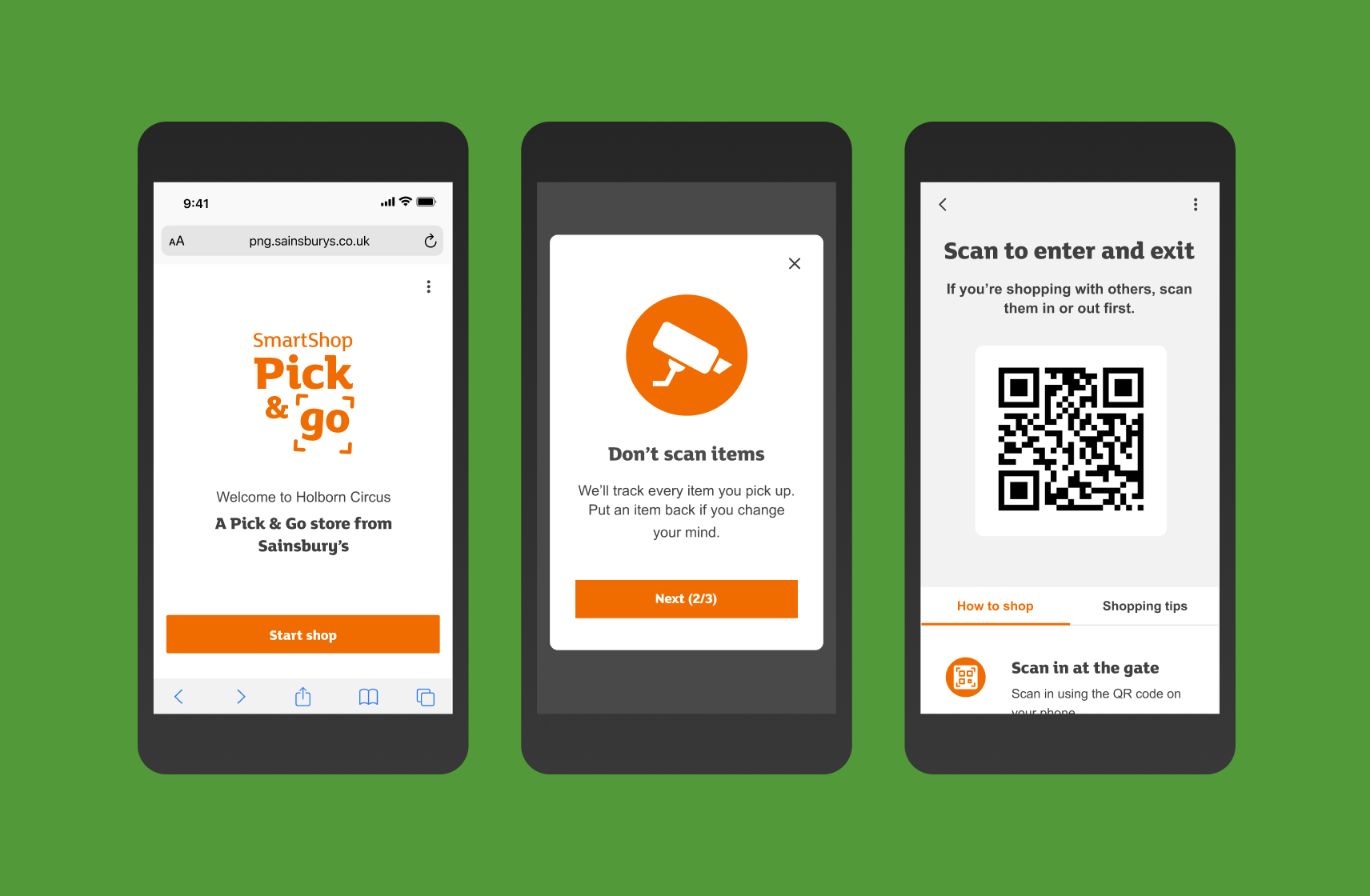
Problem
The aim of the Waste Less Save More site is to help customers waste less food and therefore save money. The site does this by providing the following:
- Tips on how to make perishable food last longer.
- Find recipes by inputting left over ingredients. [Food Rescue].
- Showcase what Sainsbury's are doing in the community to help tackle food waste.
The team understood that the majorty of traffic to the site was on mobile via Facebook paid for advertising. However, the problem we faced was a very shot session time per user.
We were asked to look at the experience the current site provides, understand whether the content was in line with customer expectations and needs, and find ways to help customers find relevant content.
Research
Existing analytics showed that the majority of customers would read a single article before leaving. There was no evidence that users were discovering other content on the site, such as Food Rescue, which we knew was a powerful and popular tool for those that knew about it.
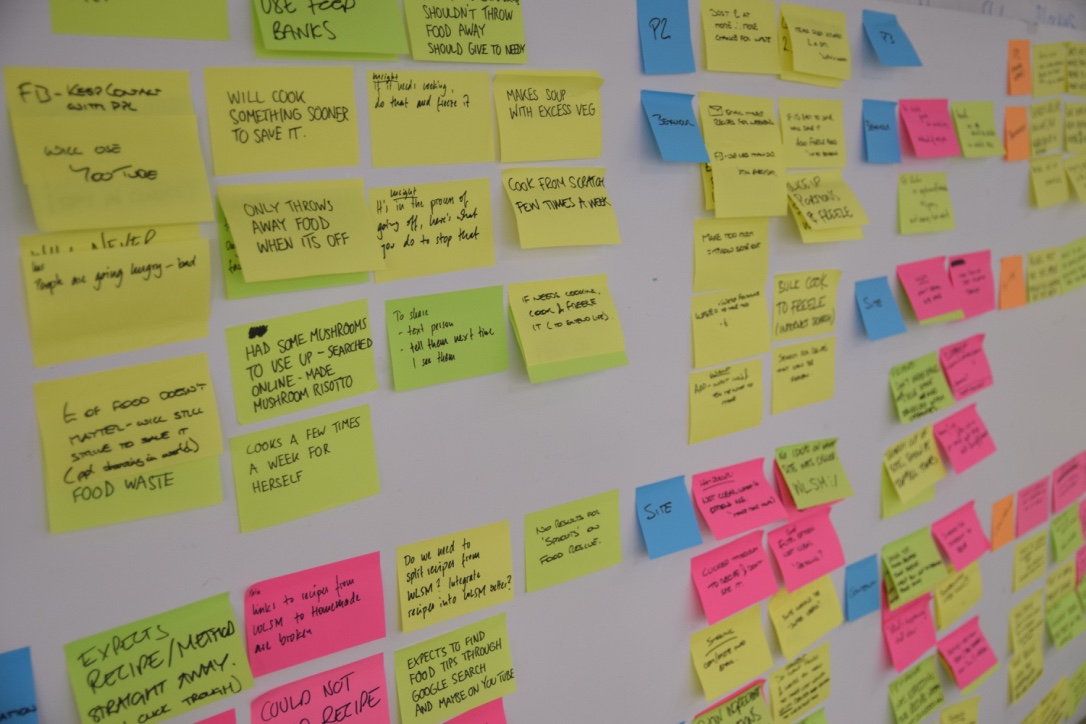
With the assistance of a UX Researcher, we conducted 10 depth interviews with customers. The research aimed to observe user behaviour on mobile devices, understand their thoughts on the content, and see how we could increase engagement with relevant content.
The research highlighted the following key issues:
- no quick next steps once an article was read.
- articles had poor content hierachy, which could cause cognitive load and reduce the desire to read more articles.
- inability to easily and quickly share tips and recipes with friends.
- 'inspiring content' was overshadowing the more useful and practicle articles and tips, which became difficult to find.
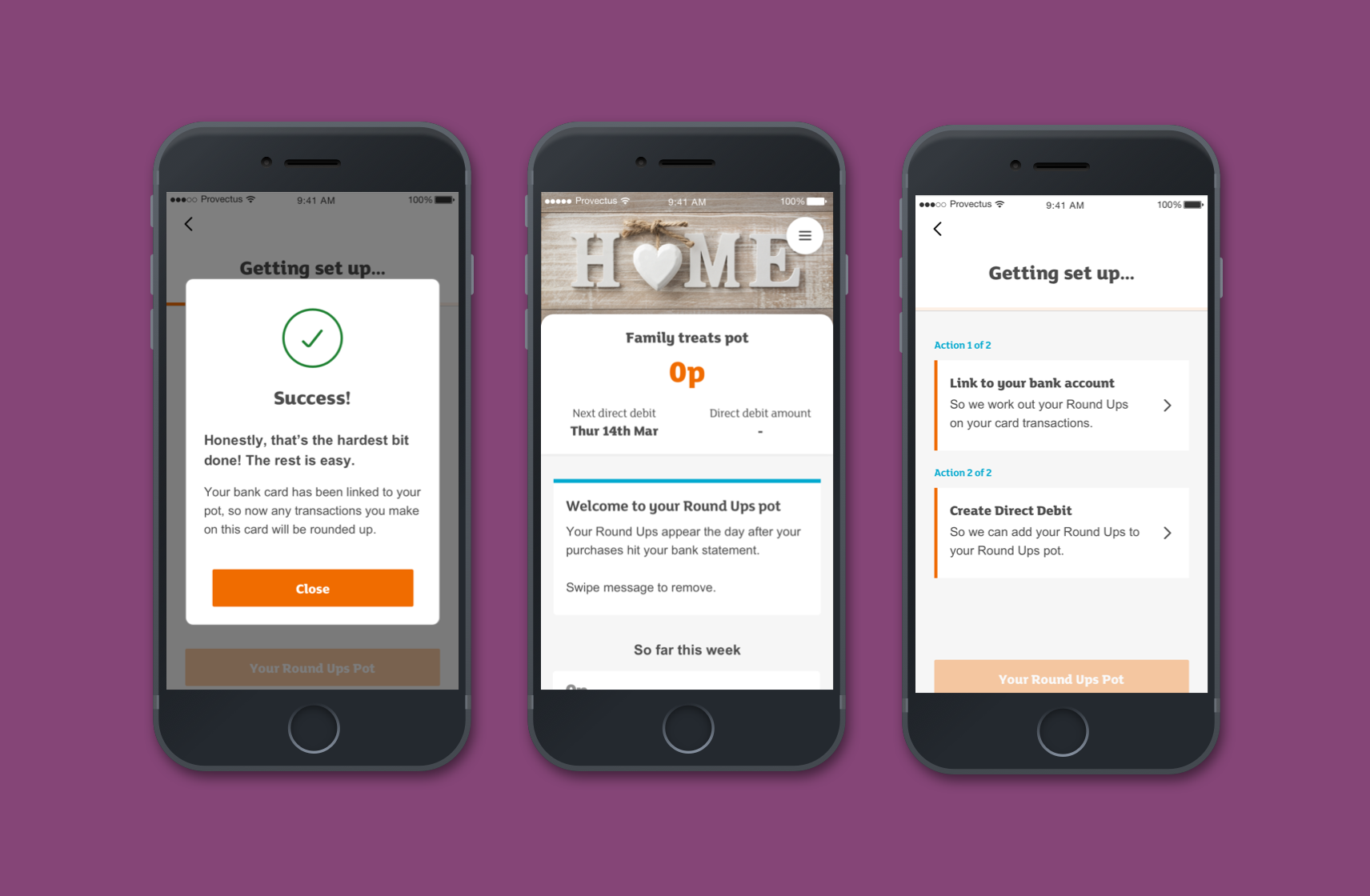
Sketching & design
I sketched out quick ideas for key pages through the site, then working with the Creative Director and Senior UI Designer we finalised which would be taken in to UI design.
As I planned to work closely with the UI Designer during the full UI design phase, and due to having limited time on the project, we felt there wasn't any benefit from creating wireframes and to get straight to full design.
Core changes we made included:
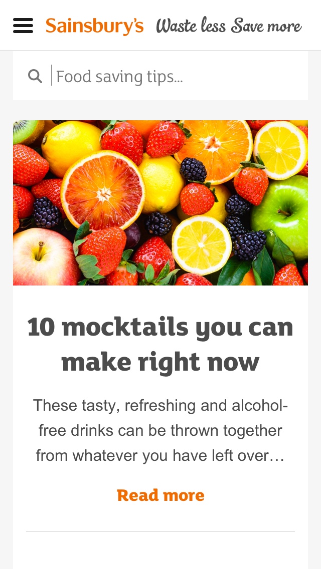
- Article content hierachy: to reduce cognitive load, allows users to understand which images relate to which headers and content.
- Infinity scrolling articles: each article rolls in to the next, taking away reliance on user consciously selecting a next action.
- Social sharing: on whole articles and each individual tip/recipe within the article.
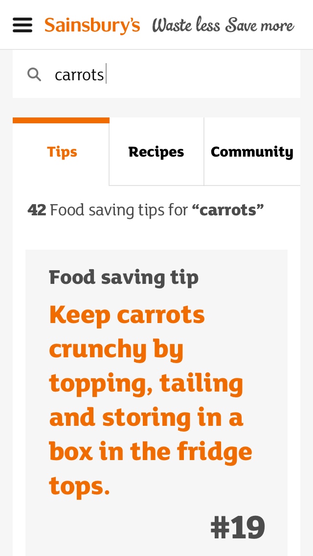
- Article tags: we introduced prominent tags for each article, so users could continue their experience and find related articles.
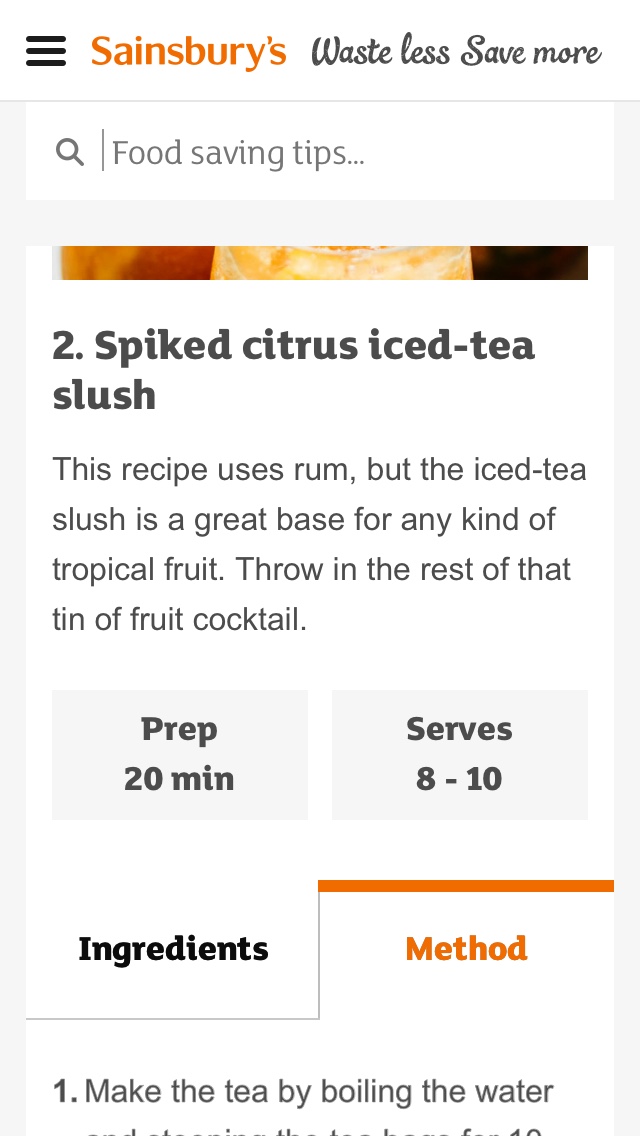
- Recipe integration: many articles linked to 3rd party recipes, taking customers away from the site. We brought these back within the site so recipes could be actioned.
- Search results: distinction between inspiring articles, tipes and recipes, with the hierarchy in favour of the latter two.
Redesign research
I decided to learn how to use Principle and created an animated prototype of the key changes we made.
We conducted more depth interviews with customers to understand a few key elements; were articles easier to read with clearer content hierachy, could users access recipes and how did they react to the different ways to find more relevant content.
Initial verbal feedback in the sessions was positive, but ultimately the true test of these designs would be with live data.
UI Credit: Lee O'Connell
Feature prioritisation
I ran a quick exercise with the team, including Product Owner and Developer, to understand the feesiblity of build for each feature and how complex it would be.
This would have been a starting place to move in to organising a sprint board.

What happened next
A core part of this work was to convince the business to invest further in to Waste Less Save More and start a build phase.
One of the key reasons to use Principle was the ease at which I could put the prototype or video recordings in to stakeholders hands, rather than just having a report to read.
If I did this project again
At the time of this project, Sainsbury's hadn't adopted more agile ways of working, hence why this was a tactical design sprint with only 1 developer on board.
Unfortuntely the project was not deemed high enough of a priority in comparison to the Sainsbury's e-commerce projects that were underway, so further budget was not secured for the changes to be made to the live site.
Ideally this project would have had a larger cross functional team so we could have taken the prioritised elements and started working collaboratively in sprints.