Lloyds banking Group
Current account & Credit Card redesign
Role: Senior UX Designer
context
mission
To improve our customers’ financial lives by making the day-to-day banking brilliant and to help our customers stay on top of their bills, commitments and spend.
Today
'Everyday' is the collective term for Current Account and Credit Card existing customer experience.
The MVP for Everyday (Q3 2024) was officially launched in the new redesign and branding. We are now looking at how the existing user experience for current accounts and credit cards could evolve.
For sake of brevity, the below will outline some of the more impactful and key aspects of the work.
business GOal
"To be the most recommended and best banking app in the UK."
insight
User needs
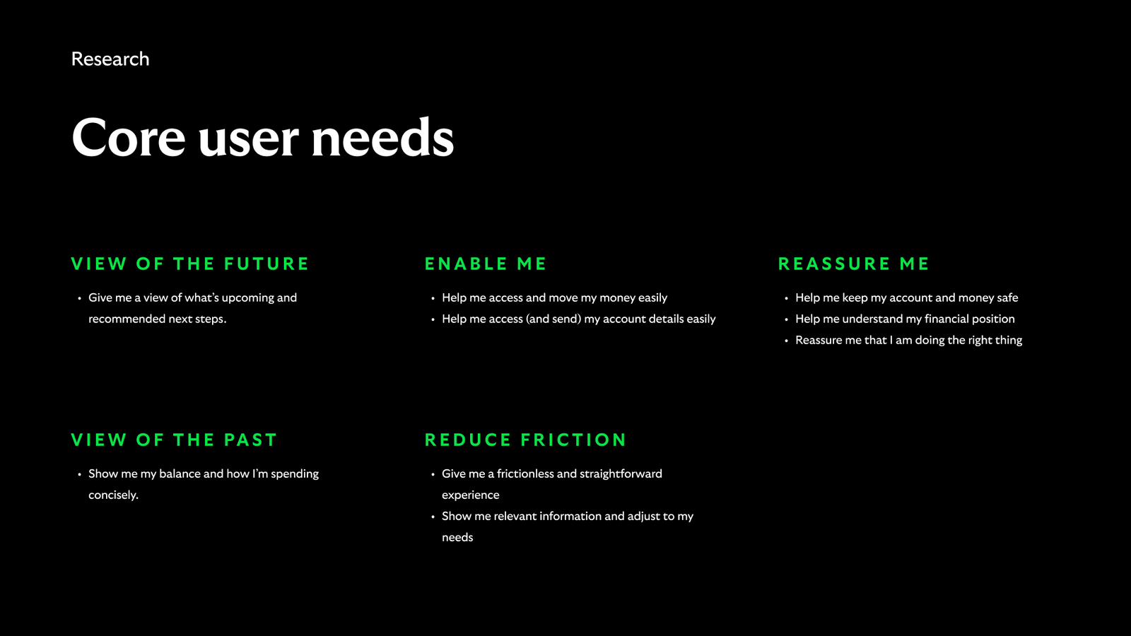
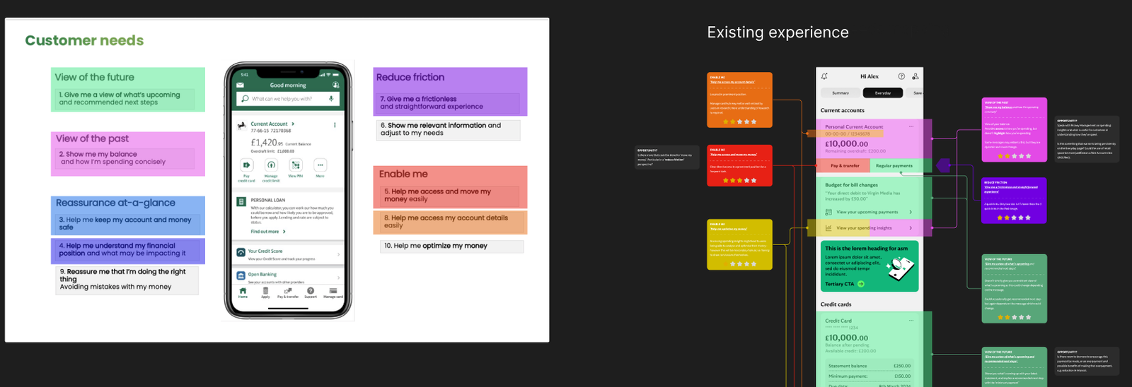
We already had previous qualitative research that outlined core user needs for Everyday customers.
But, how well were we adhering to these in the Everyday experience we'd just put live.
insight
User needs
We already had previous qualitative research that outlined core user needs for Everyday customers. The question was, how well were we adhering to these in the Everyday experience we'd just put live.
Research
continued research showed ongoing issues
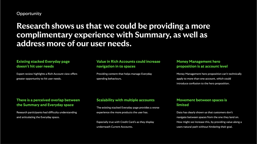
There were still several existing issues with the live experience of Everyday. Whilst not an immediate problem (as it was a reskin of the current experience), it was going to impact our abliity to reach the business goal of the best and most recommended banking app in the UK due to a lack of scalability and growth.
redesign
An alternative design
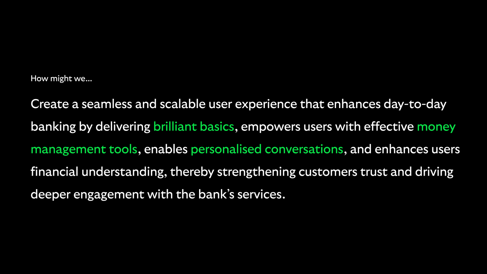
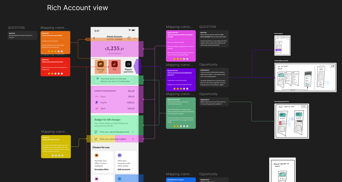
Whilst we were delivering the MVP version of Everyday for April 2024, we were also working on an alternative design style, named Rich Accounts.
The purpose of Rich Accounts was to give a dedicated page to each Everyday product (current account and credit card) the user had.
The more Everyday products the customer had, the worse their experience would be as they would stack under each other as tiles. A dedicated page per account would give opportunity to provide more value to customers and enable us to hit the core user needs.
expert review
Launched experience had limitations but the alternative design didn't
The launched version of the Everyday space was generally speaking a re-skin of the existing experience, with the introduction access to upcoming spend and spending insights to give a fuller picture of financial situation.
Post launch was an opportunity to take a fresh look at the experience and evalute it against our core user need.
I reviewed the existing experience against our known core user needs. This highlighted that we were going to be limited in excelling against these needs based on the current stacked layout of Everyday products (current accounts and credit cards).
There was no room for growth.
influencing product
selling the 'rich account' alternative design to the Snr product owner
The Rich Accounts concept was controversial because it would mean the removal of one of the main navigational elements the business had pushed for.
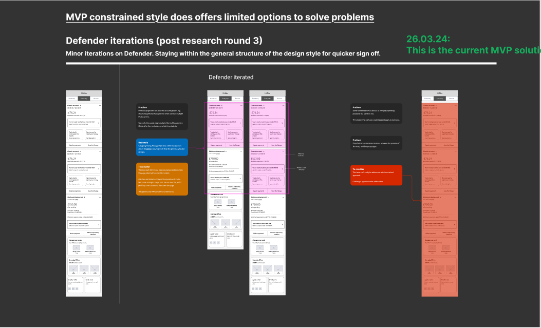
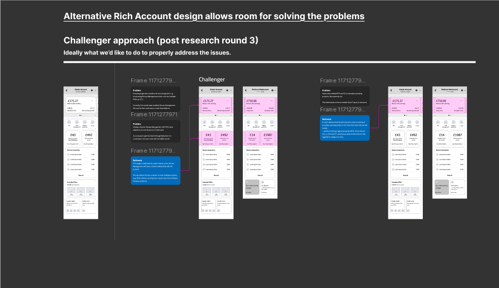
I visualised and walked through with the Senior Product Owner how the existing constraints impacted our ability to meet the business goal and excel at meeting our customer needs.
Side by side I showed how these same problems could be solved easily with a the alternative design.
This was emphasised by a prototype the Visual Designer put together to put on a mobile and in the hands of the Product Owner.
Outcome: The Product Owner was convinved by the growth potential the alternative design provided. This was the first step. Next was for the Product Owner to start selling this across the business.
iterating design
conducting several rounds of qual research to refine rich accounts
We conducted multiple rounds of research (with a third party agency). A key part of this invovled me briefing the agency on our key objectives of the research.
Key questions included:
- could customers understand their financial position when provided with upcoming payments (bills total) and spending insights alongside balance?
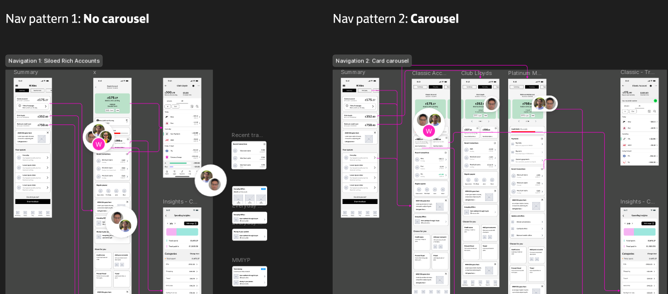
- Did a carousel or no carousel between accounts help customers in understanding their financial situation?
- was access to full transactions hindered by the new page layer introduced with Rich Accounts?
- could customers locate card management features and as such reduce call centre costs?
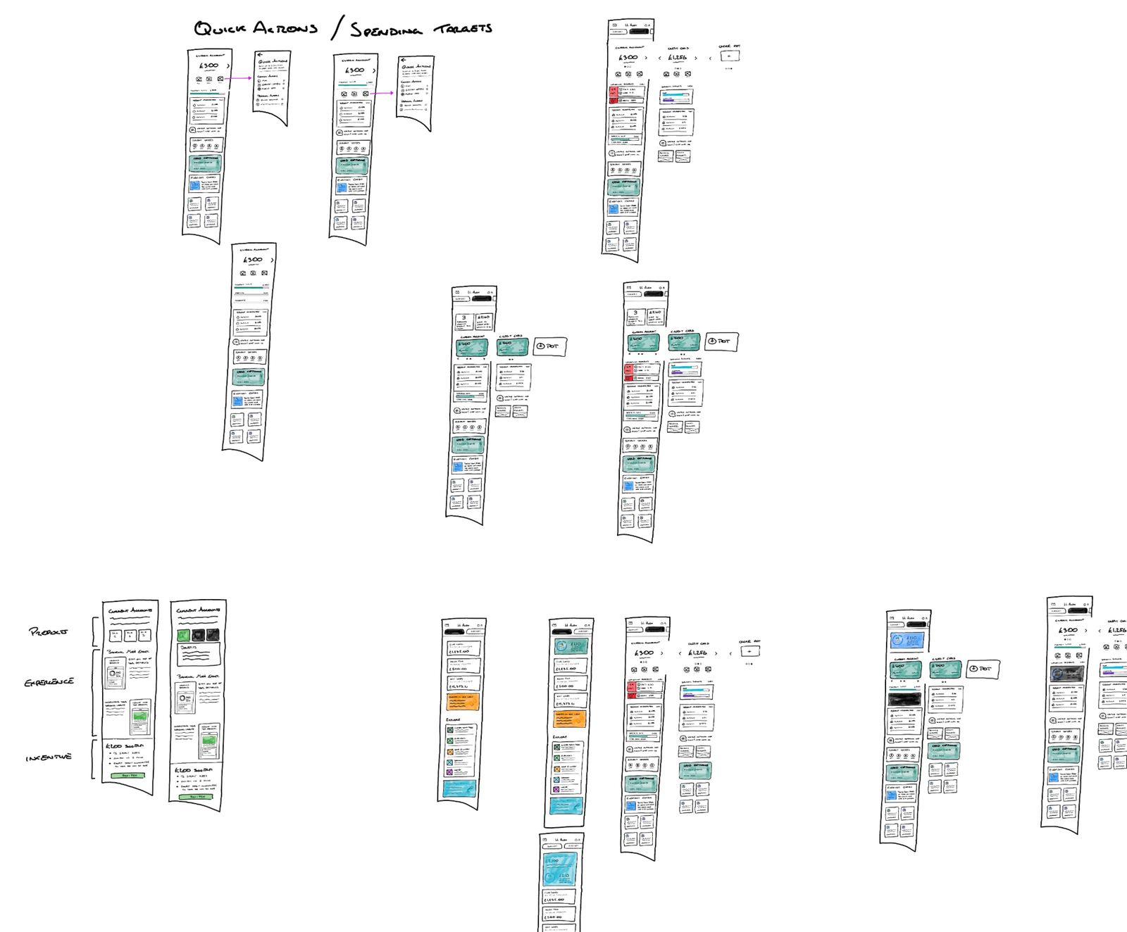
Example of some Rich Account sketches
Navigation patterns: Carousel vs no carousel between accounts
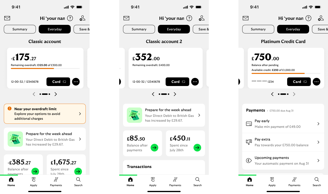
Carousel design for testing
Note: To increase speed of work, the Visual Designer and I both worked at the visual level utilising the Lloyds design system.
(Visual Design credit: Josh Press)
Carousel design for testing
Note: To increase speed of work, the Visual Designer and I both worked at the visual level utilising the Lloyds design system.
(Visual Design credit: Josh Press)
Carousel design for testing
Note: To increase speed of work, the Visual Designer and I both worked at the visual level utilising the Lloyds design system.
(Visual Design credit: Josh Press)
Hypotheses for Rich Accounts
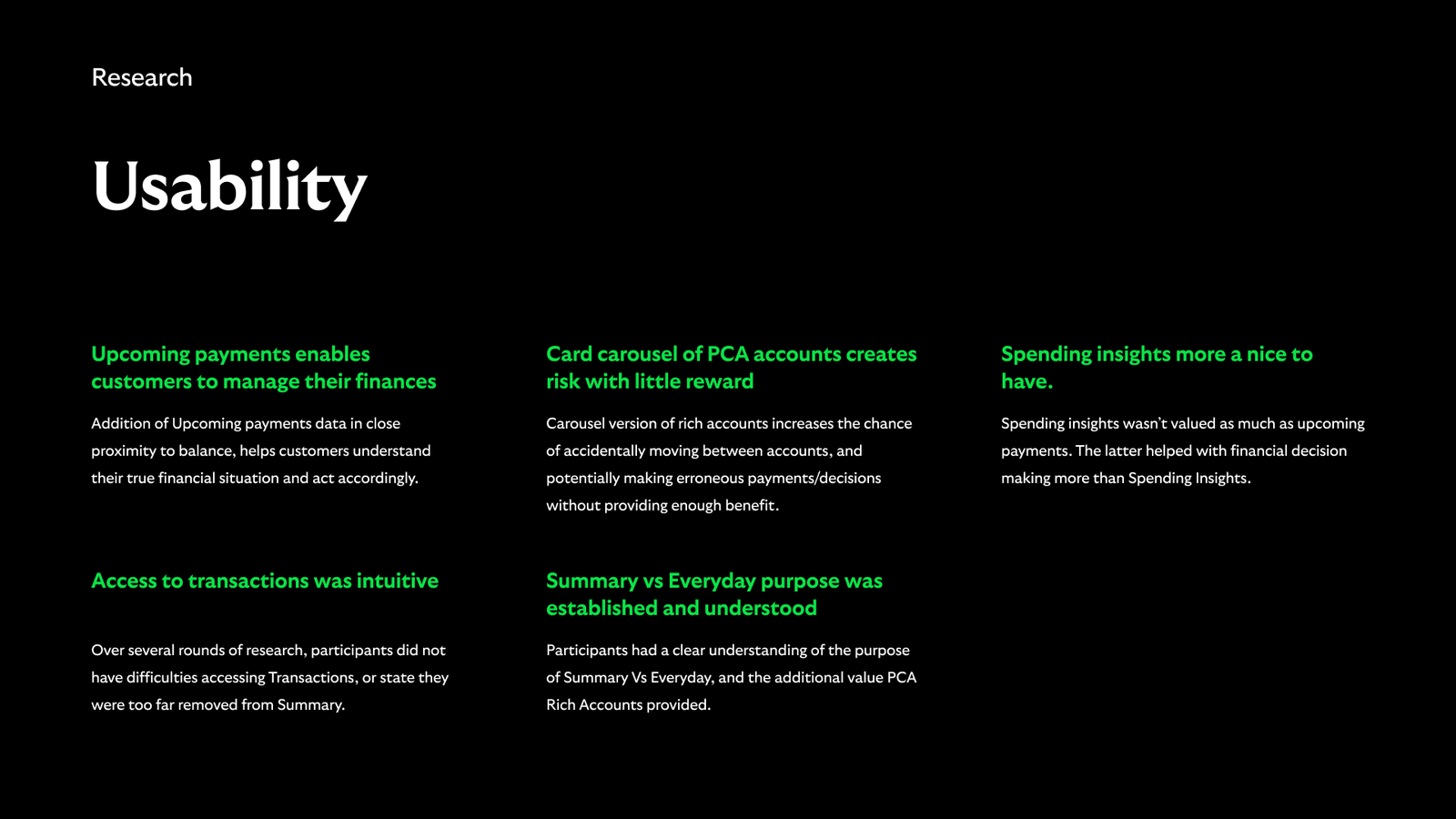
Research insight
Rich Accounts proving to assist in understanding financial situation
The multiple rounds of research brought us key insight that informed our interations. Ultimately Rich Accounts was enabling customers to manage their finances with more confidence and less cognitive load.
deployment
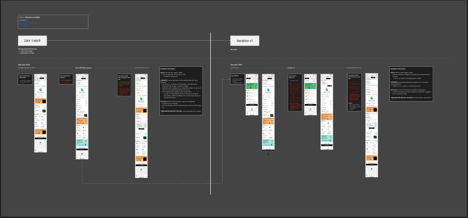
Phasing the release of rich accounts PCA
Technical retraints meant we couldn't release the vision of the Rich Account PCA (Personal Current Account) view. So we had to phase it.
The Product Owner had a phased approach which I took and added the following layers to understand the overal value of each release to customer and business.
- Value to the customer
- What we'll learn from each release
- Are there political / internal benefits from a Product Owners perspective
- Timeframe between each release
- Technical reasons for the sequence of releases
Understanding this would enable us to justify each release to the business.
deployment
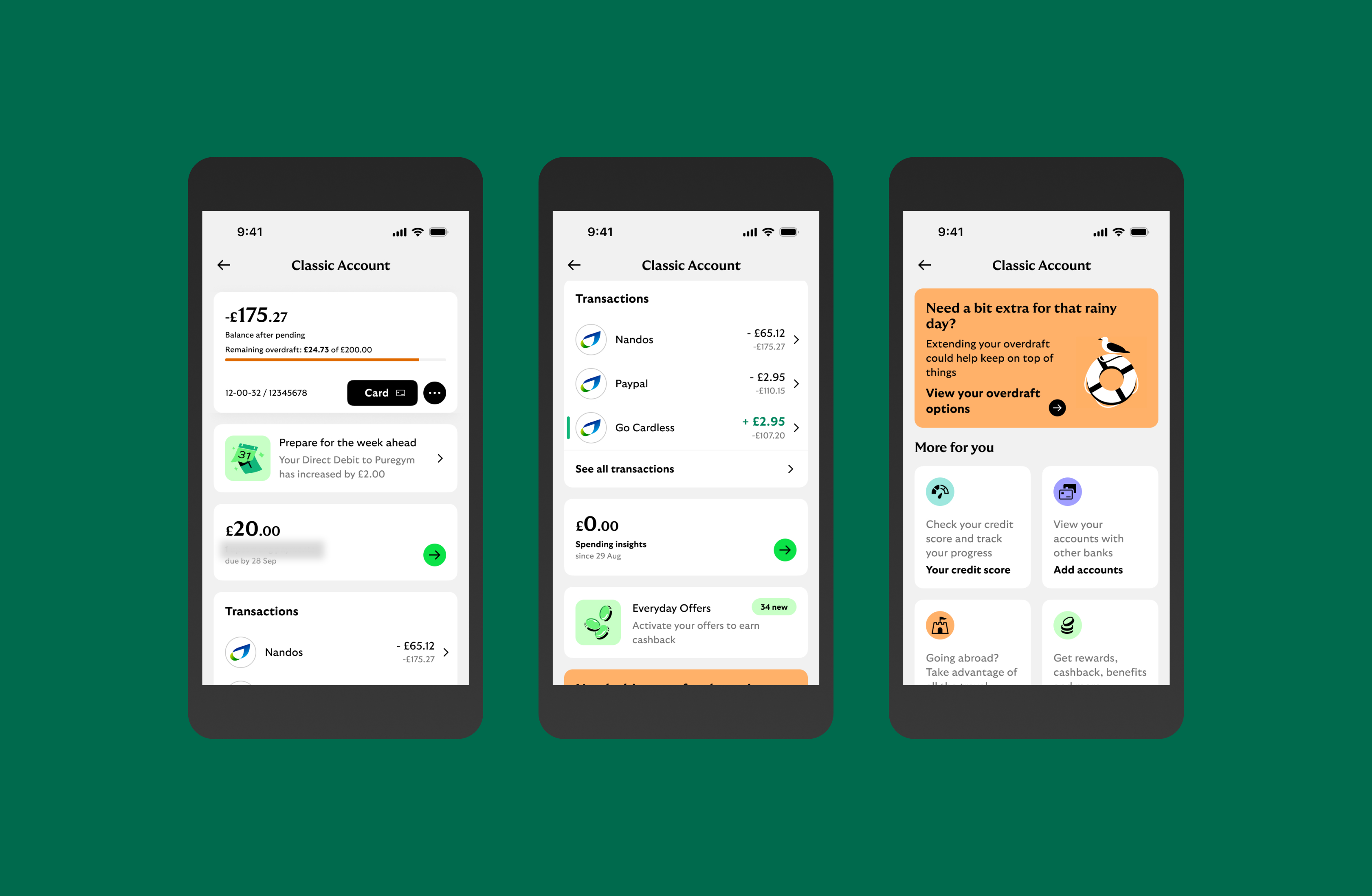
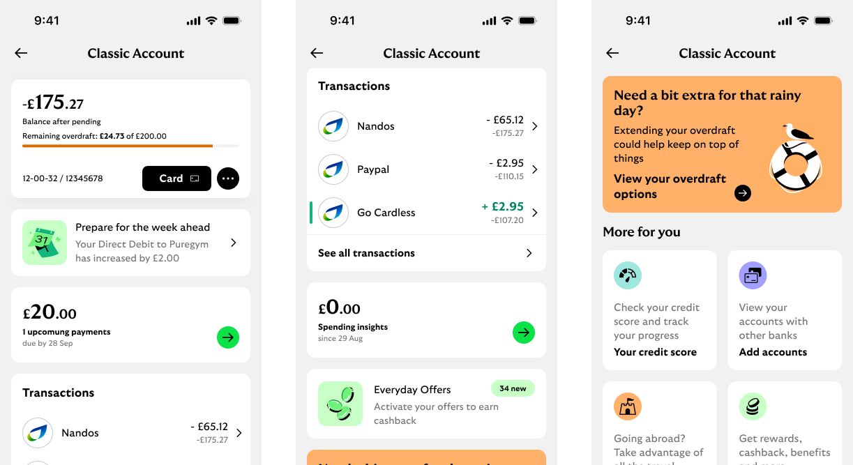
LAtest rich account designs
The phased approach to Rich Accounts is underway, with the first release happening by Q2.
Below is the latest design of the current account 'Rich Design' that we're aiming to iterate towards.
Latest Rich Account designs for current account
Metrics
A/b test
Whilst we have confidence based on the qualitative research we've done to date, we need to further increase this confidence with the business that the Rich Account alternative design will perform in a live environment.
I created the following hypotheses for an A/B test, and helped the Product Owner on how to approach these. Below are a selection of some of these hypotheses.
- Hypothesis: Rich Accounts will reduce the number of contacts regarding Credit Card due date information.
- Measures:
- reduction in in app survey responses on this topic
- reduced call contacts / complaints and chatbot enquiries
- Hypothesis: CTR to Transactions will reduce, however we won't see an increase in complaints regarding access to Transactions.
- Measures:
- CTR to transactions
- Contacts re access to Transactions (survey, calls to contact centre, chatbot enquiries)
- Hypothesis: Rich Accounts will generate a higher CSAT score amongst Everyday customers who have multiple accounts.
- Measures:
- CSAT score of those on Rich Account version vs the existing / control experience.
- Hypothesis: We will see an increase in key features that were previously missed by customers, i.e. upcoming payments and spending insights.
- Measures:
- CTR on Rich Account to Upcoming Payments and Spending Insights vs the existing experience.
- Hypothesis: We will see an increase in customers accessing Everyday Offers, a key commericial drive to the business, with Rich Accounts vs the control.
- Measures:
- CTR to Everyday OFfers