Tu Clothing
Responsive design
Role: Lead UX Designer/Researcher, Project Lead
Brief & approach
The Tu stakeholders noticed they had very low users on the app, and much higher usage on mobile web, so they were keen to move to a responsive site and utilise the Sainsbury's design system, Luna.
As the Digital Experience hadn't previously been involved in the website or app, we saw this as an opportunity to showcase a customer led approach, rather than just a visual redesign.
With this in mind, I was keen to start off with discovery based depth interviews to understand how customers felt about clothes shopping at a broader level and how digital helps and hinders this. This would give us the basis to create a great shopping experience for customers whilst also driving conversion.
Discovery research
I structured and conducted 12x depth interviews with Tu customers to understand:
objectives
their personal relationship and attitudes with clothing.
how they currently shop for clothing.
the role online plays with clothes shopping and potential hinderances it causes.
research highlights
Insight from this research highlighted that product fit and quality was of high importance, but was difficult to establish when online.
On a positive note, Tu was commended for using models of average size and including this information as well as the clothing size they were wearing. This helped customers make an better informed decision whether the clothes would fit.
Discovery research
I structured and conducted 12x depth interviews with Tu customers to understand:
- their personal relationship and attitudes with clothing.
- how they currently shop for clothing.
- the role online plays with clothes shopping and potential hinderances it causes.
Insight from this research highlighted that product fit and quality was of high importance, but was difficult to establish when online. On a positive note, Tu was commended for using models of average size and including this information as well as the clothing size they were wearing. This helped customers make an better informed decision whether the clothes would fit.
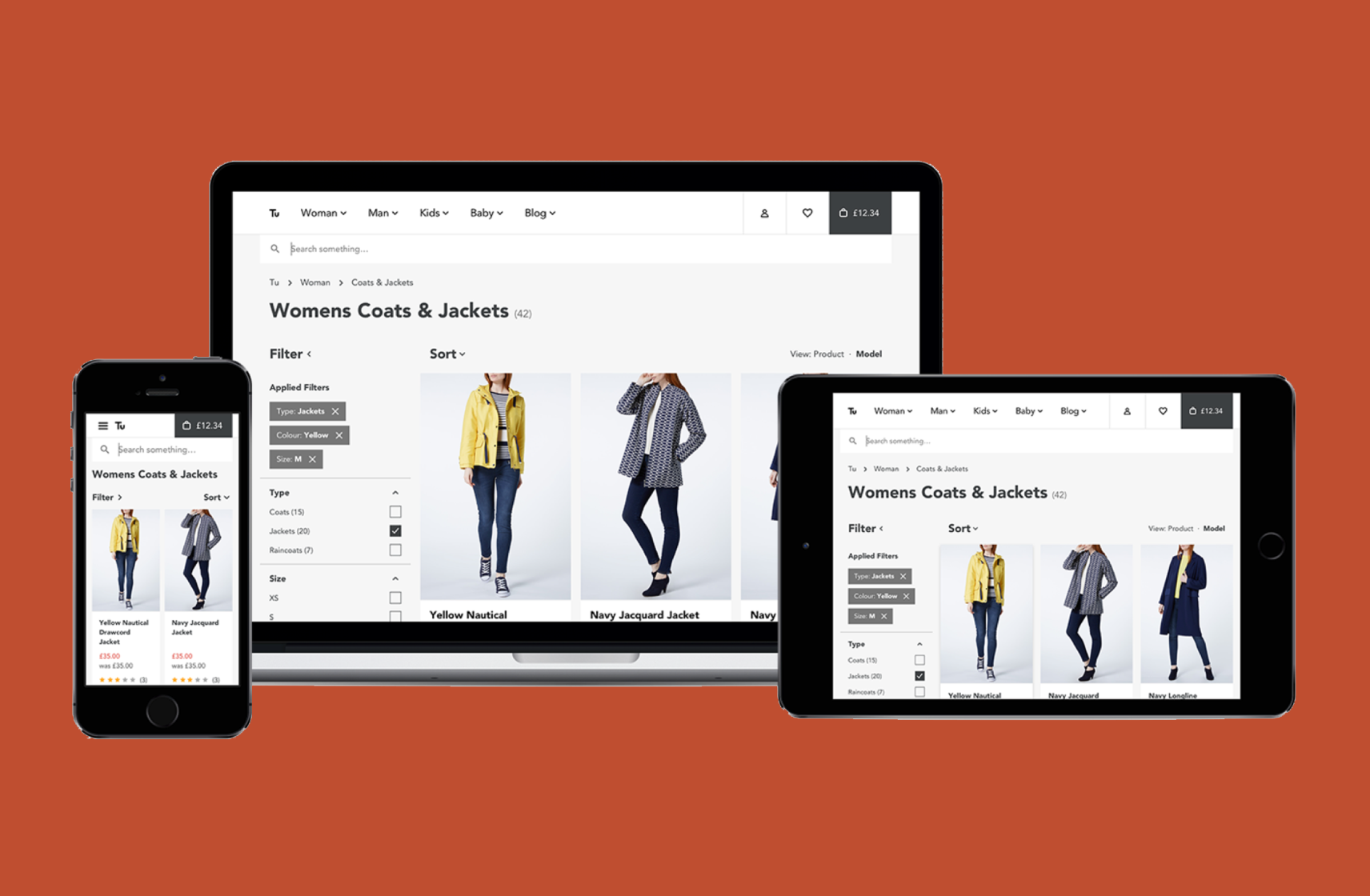
Concept designs
Using this insight, UX and UI designers started creating concepts and building Axure prototypes.
These aimed to bring forward model height and clothign size in to the product imagery higher up the page, as well as showing closeup images of the products to better get across the quality.
Working with the researcher, we planned and ran 12x depth interviews to test the concepts.
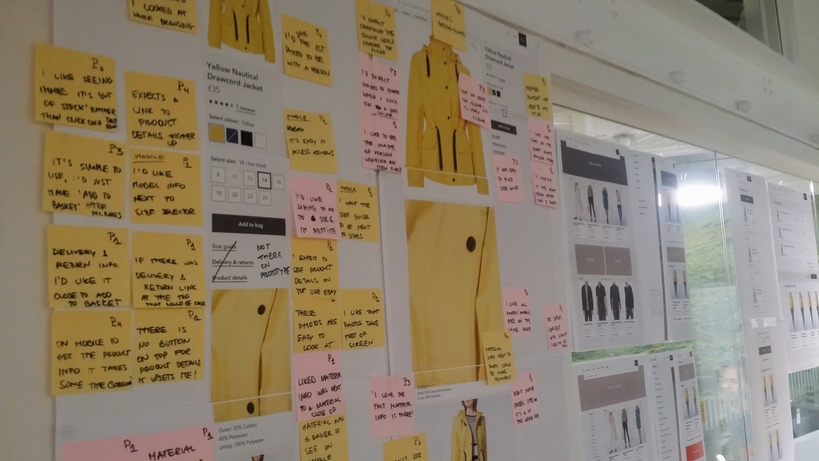
Research outcomes
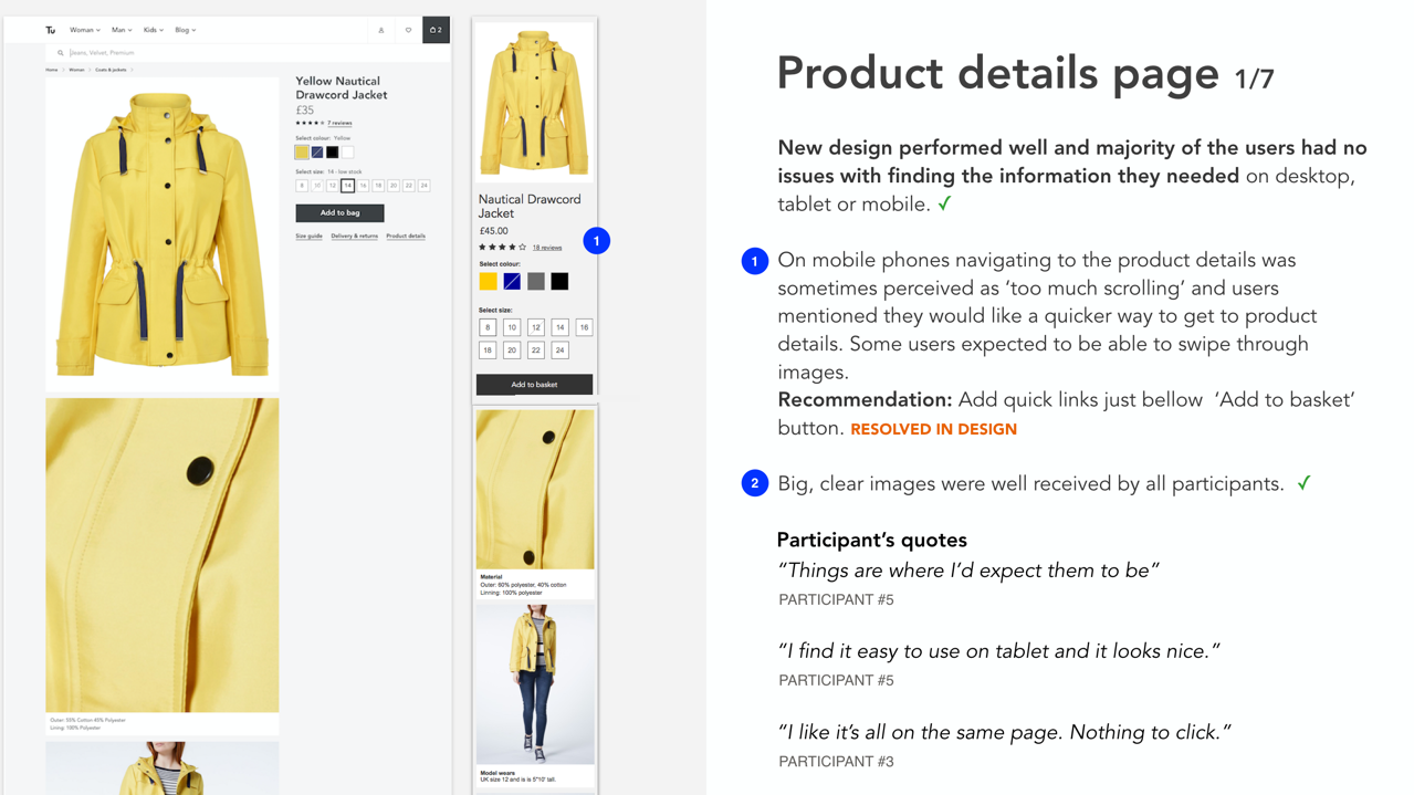
The depth interviews showed that the larger imagery, focus on quality (close up images) and highlighting height and clothing size they were wearing was an improvement.
However, the long scrolling page of images on mobile made access to other product information more difficult. This we could address with further tweaks.
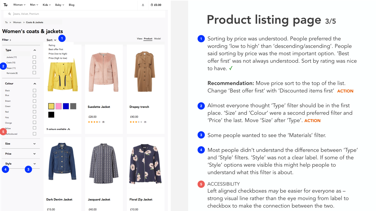
On the product listing pages, we also understood more about the hierachy of filter options.
If we had more time, it would have been great to conduct surveys to investigate the prirotiy order of filter options with a much larger sample.
Checkout optimsation redesign
Whilst the product detail and listing page concepts were being finalised, myself and another UI designer paired to focus on checkout.
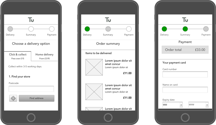
Existing analytics showed that customers were spending a long time in the checkout journey with some drop off throughout, presumably due to it’s length.
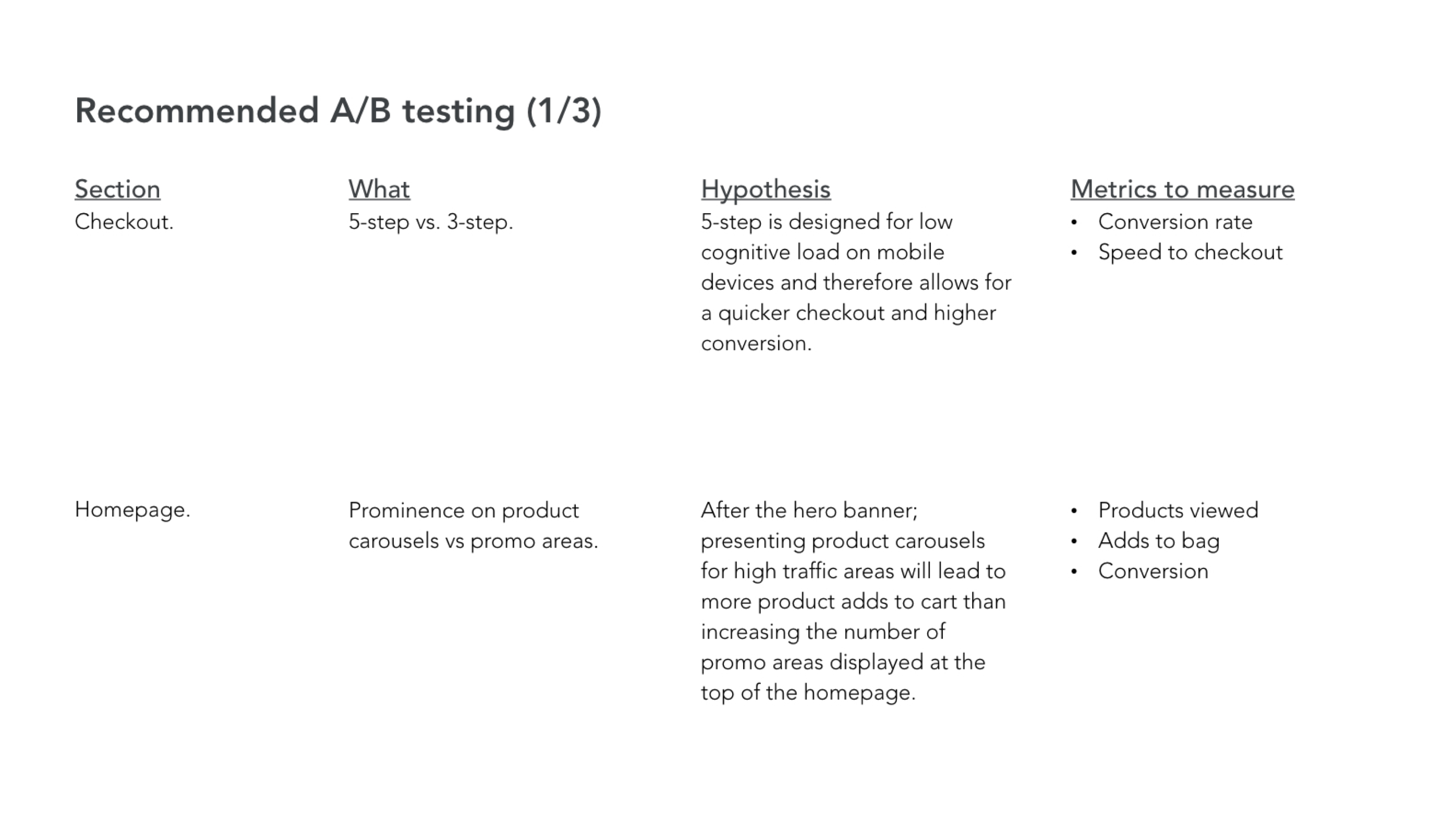
Unfortunately we weren't given the time or budget to understand the 'why' behind the drop off within checkout, so we created a 3-step and 5-step versions of the checkout process to test alongside the existing 7-step.
I was keen to understand whether there was more cognitive load when it came to fewer steps but more scrolling, vs more steps with limited scrolling.
Checkout research outcomes
We took the prototype in to depth interviews and the qualitative insight showed that the shorter 5-step approach was a good middle ground of the process not feeling too long, but each step not being too arduous.
Although the intiial qualitative insight was positive, we wanted to have greater confidence changing such a key element of the experience. As such as we proposed an A/B test of the 5-step vs a 3-step to be done at a later date.

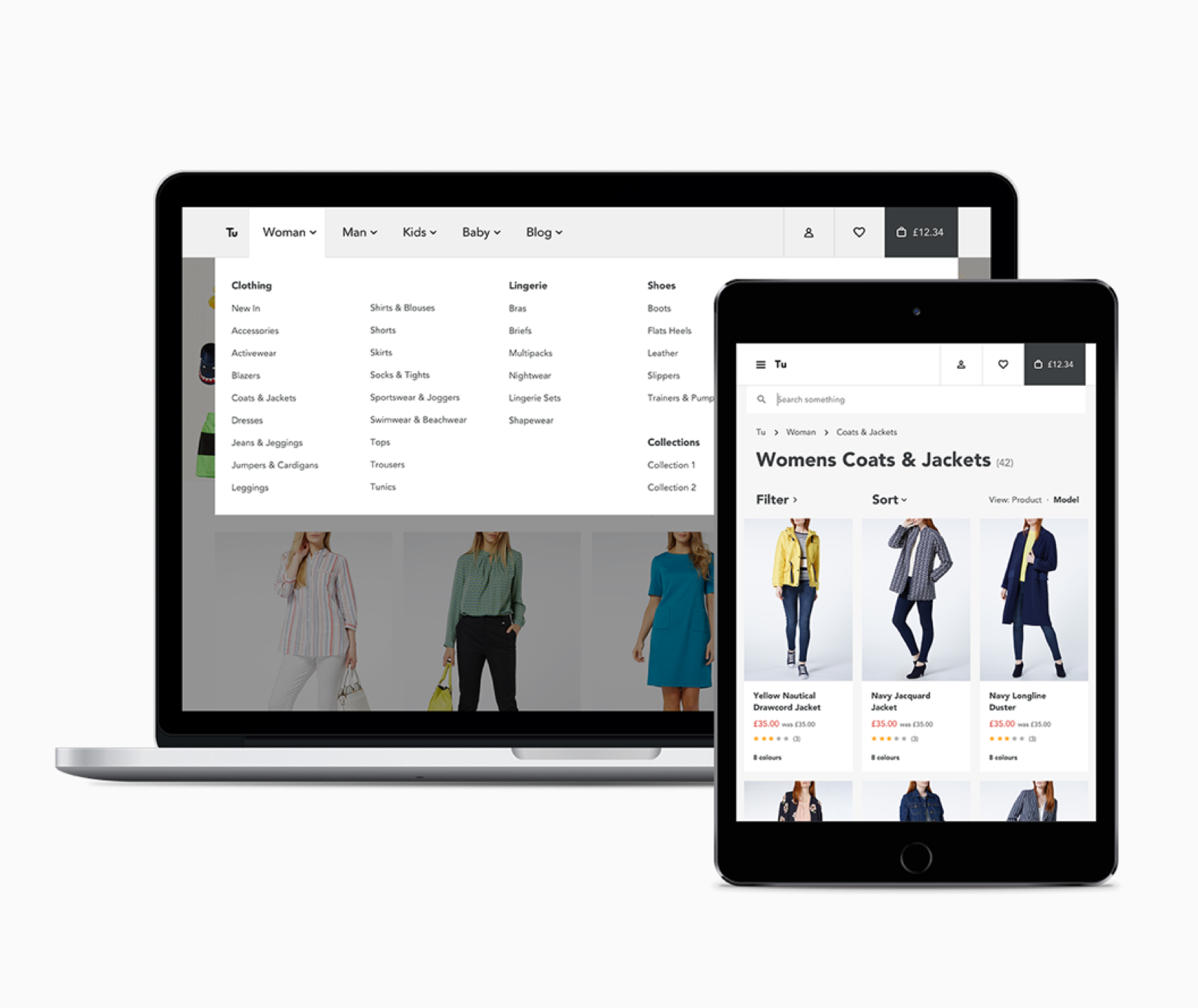
Mega menu
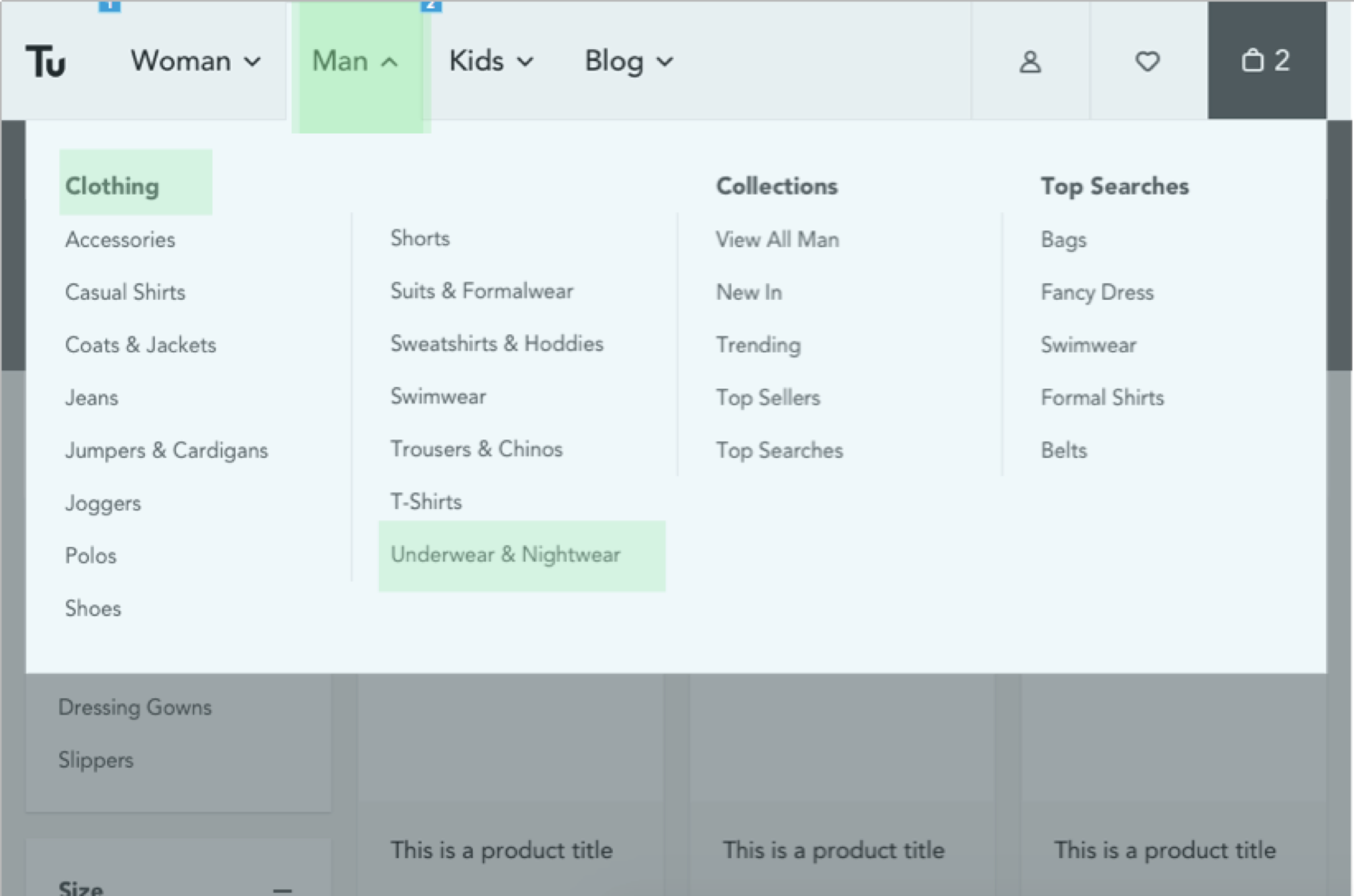
Using analytics we identified which sections were accessed least. We also noticed that the menu was overloaded with links which could increase cognitive load. We consolidated the options down to a more manageble number, more fitting for a mega menu.
Working with the UI designer, we created rules around the mega menu, including a limit of items per column, and at which device size it would change to a hamburger menu.
MEGA MENU research outcomes
We tested key journeys (based on most frequently bought items per section) to establish whether customers found the new mega menu structure to be an improvement.
It was observed that customers were spending less time using the mega menu and getting to the product listing pages they were interested in vs the existing site.
We had enough confidence that this was a positive change, however, given more time I would have liked to conduct a tree-jack exercise with larger numbers to validate this further.
Next Steps
Unfortunately this was a tactical project with the design work being done in silo of a development team. However we did involve a front-end developer during the project to discuss feesiblity of what was being designed, as well as create a build and rollout plan.
We also recommended the following:
Several rounds of thorough accessibility research.
A/B testing options.
KPI's to measure success.